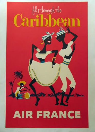
As fall turns to winter in the Northern Hemisphere, travelers have always looked to the Caribbean for a little warmth. But it wasn’t just exotic beaches that were advertised; the region’s exoticized black bodies have always been a part of its allure. I’ve got mixed feelings about some of these. What do you think?
Please don’t forget to follow me on Twitter @FlyBrother, and “like” me on Facebook! You can subscribe, too! ![]()

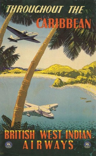
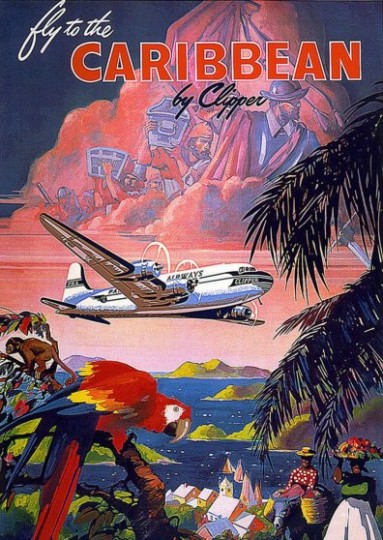
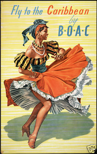
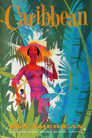
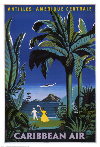
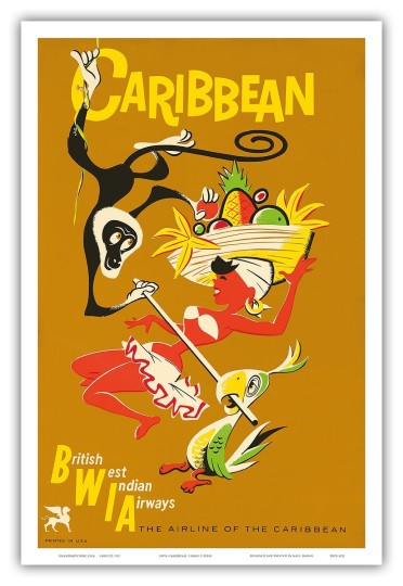
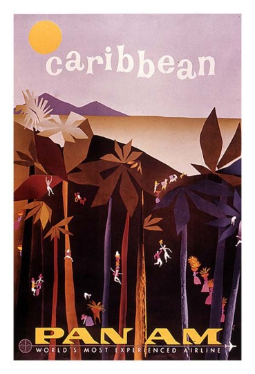
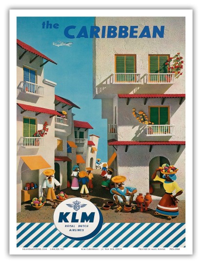
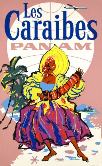
OH MY GOD, the conquistadors in the sky in that Clipper one, literally plundering the place – that’s disgusting.
I actually kind of like the Caribbean Air one because (I think) the Caribbeans in it are dressed in modern, stylish clothes – I might be misreading it but it comes across to me as “stylish locals hanging out on the beach”. Unless the yellow dress is supposed to be a ‘charming native costume’ rather than an evening dress, in which case back ’round to blech.
I definitely think there’s major exoticizing going on here, but then, it’s all part of selling a destination, right? I’d also be interested in hearing how people from the Caribbean feel about the renderings of the people, because I gather that some of them may be homegrown artistic styles. Still, in light of global misrepresentation of people of color, I have to give a few of these posters the side-eye. I do like the Pan Am one where the woman is selling necklaces and the BOAC poster with the dancing lady, but then, I prefer realistic representations to caricatures.
Thanks for commenting!
I think firstly we’d have to look at the flip side—how European destinations were sold at the same time. I think we’d find the same kind of boilerplate. Not all of Spain is bullfights and not all of Britain are royal guardsmen in tall bearskin hats, yet that’s how much of travel destination advertising would depict those places. Secondly, as advertising art, you have to look at each campaign in total. One “series,” often spanning a few years, would have each locale represented similarly. So for example, If Air France represented the Caribbean with cartoony dancing figures, chances are pretty good that they represented Texas with cartoony cowboys or Australia with cartoony kangaroos (similarly, if they were all landscapes with the “majestic aircraft” flying over famous landmarks or topography). So it wouldn’t be a situation where Caribbeans are not being depicted respectfully per se, only that a given campaign overall was designed with a light-hearted feel. My concern would be accuracy. Are the costumes accurate to folk dancers in the intended destination? Frankly, most advertising relies on clichés — which at its best means everyone can connect to it, we all “speak” that language; and at its worst can not only be stereotypical, but culturally insensitive as well — so overall, I can’t find too much to fault here. Let’s turn it on its head one more time: as an American of color (like myself) what would attract you to the Caribbean? The food? The beaches? What about how the black diaspora manifested itself culturally in these places (which of course brings us to folk costumes on a poster)…?